Category:
Mixed
Clients:
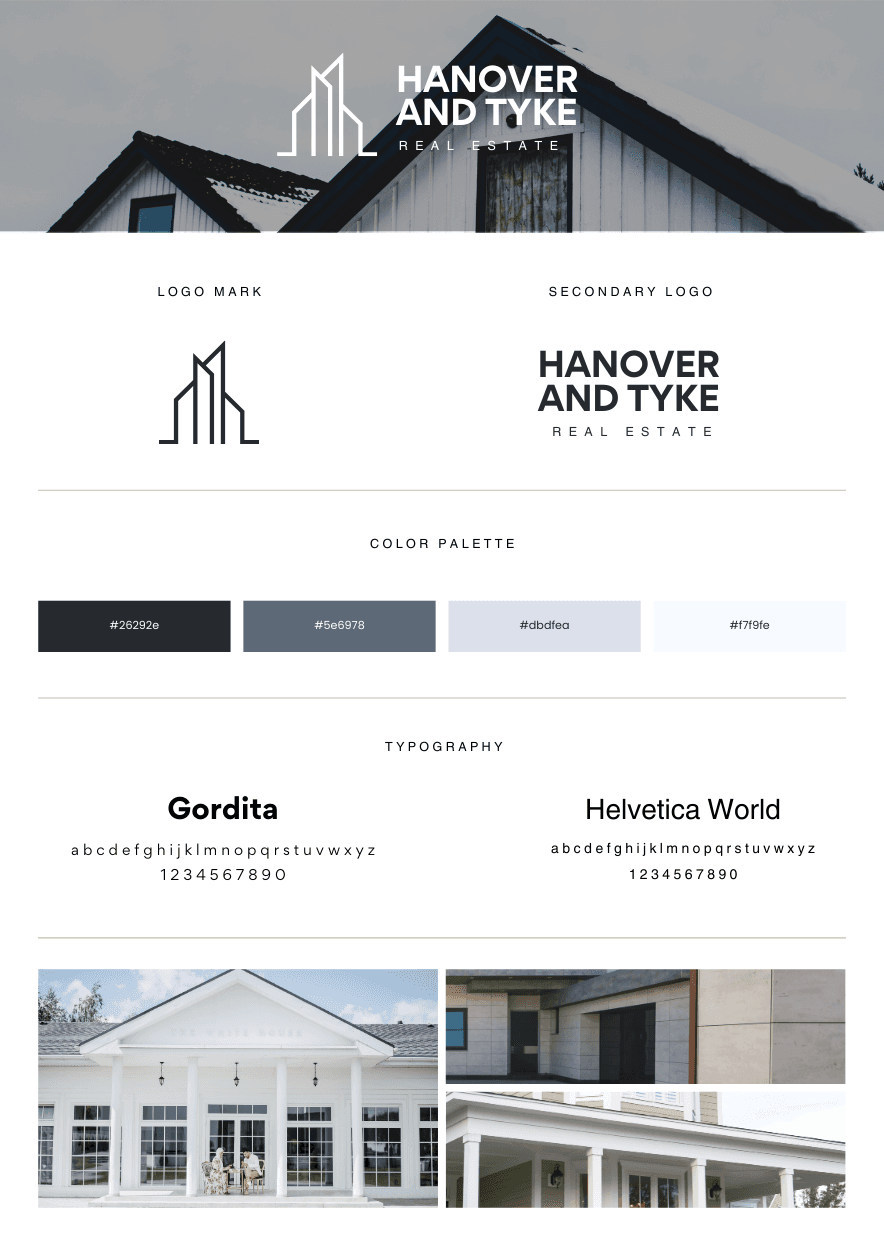
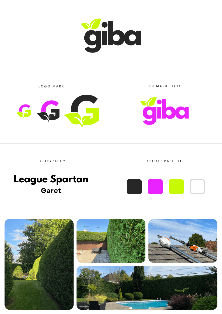
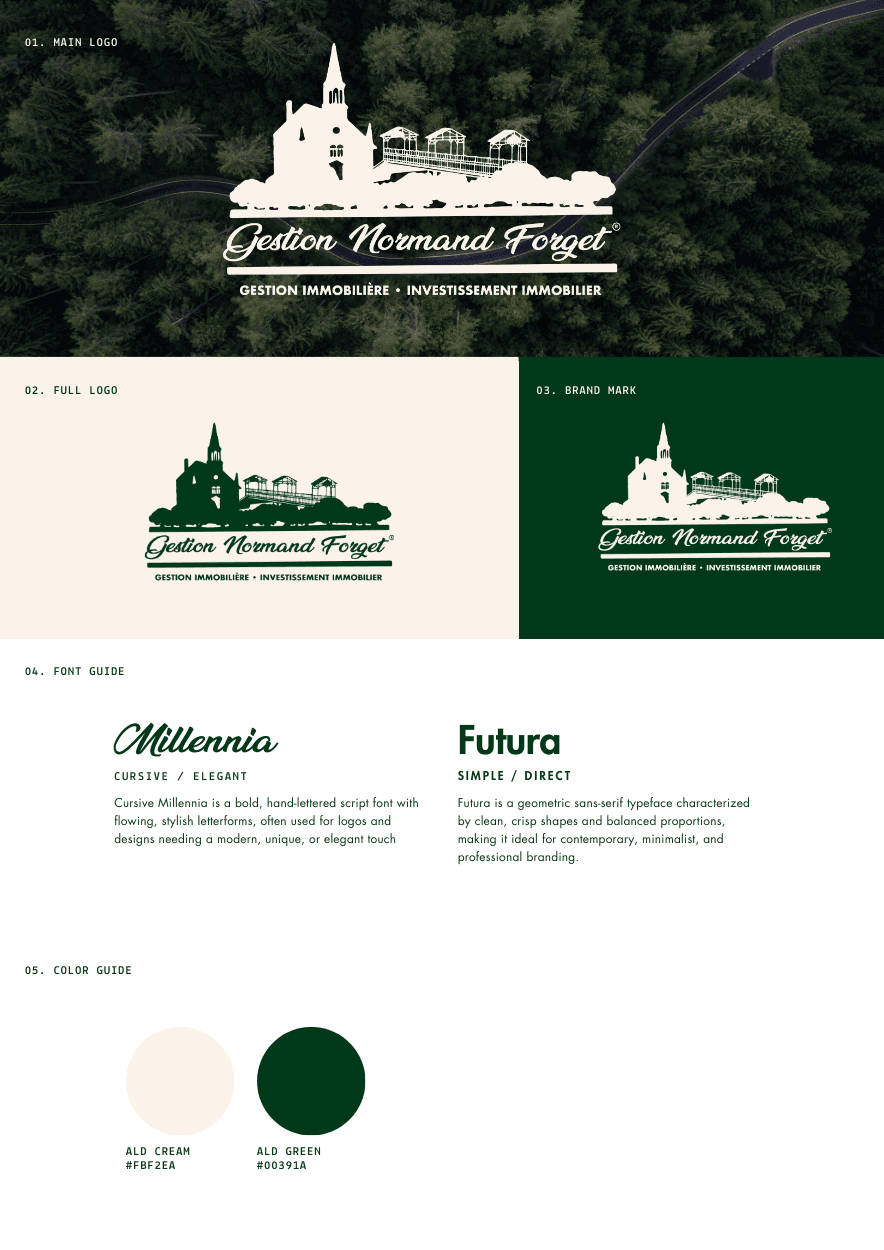
Gestion Normand Forget Inc. / Algo / Entretien Giba / etc..
The Challenge
Moonbow Média Inc. was asked to translate physical work and lifestyle into visual language. Construction professionals, athletes, and luxury businesses often struggle to express their identity beyond what they build or perform. The challenge was to create brand systems that feel tactile, meaningful, and timeless — visually strong but rooted in humility and purpose.
The Solution
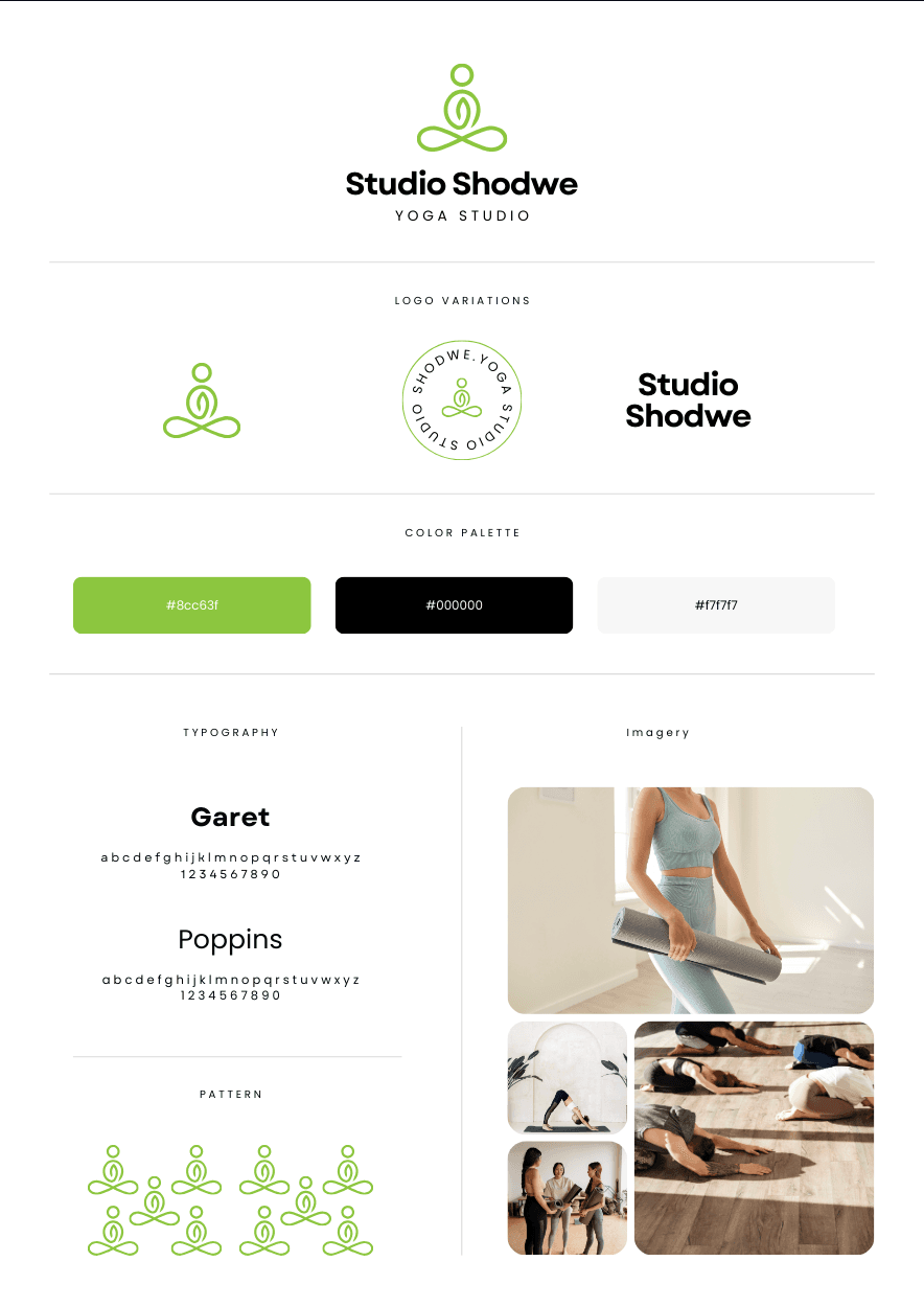
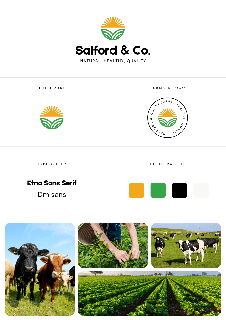
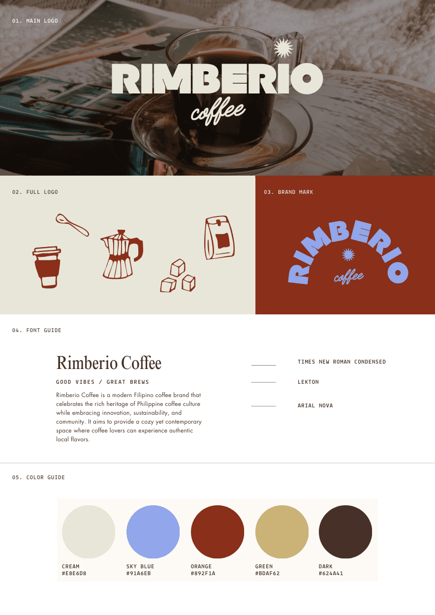
We began each project by studying the people behind the brand. Through dialogue, photography references, and material research, visual foundations emerged that spoke to both hard work and elegance. Typography resembled structure; color palettes were drawn from natural light, steel tones, wood grains, and winter skies. Every logo and identity system was built to age beautifully rather than chase trends.
The Result
Each brand identity now reflects more than a service — it expresses character. Clients walk away with a cohesive design language that lives confidently across uniforms, trucks, signage, web, and social media. Strength, precision, and sincerity unify all deliverables under the signature Moonbow Média balance of nature and craft.